KEY RESPONSIBILTIES
User research
Stakeholder collaboration
Low and high fidelity design
Design handoff
Engineering collaboration
Collaborating closely with stakeholders to
execute the end-to-end design process
Gather feedback from users
Creation of high fidelity prototypes
MY ROLE
Product Designer (Sole Designer)
Product Designer
(Sole Designer)
LENGTH
2-3 weeks
STAKEHOLDERS
CEO
Customer Success team
Software Engineer team
KEY RESPONSIBILTIES
Collaborating closely with stakeholders to
execute the end-to-end design process
Gather feedback from users
Creation of high fidelity prototypes
MY ROLE
Product Designer
LENGTH
2 weeks
STAKEHOLDERS
CEO
Software Engineer
Mastt Mastt Mastt Mastt
Mastt Mastt Mastt Mastt

Simplifying payment form
Simplifying payment form
THE PROBLEM
THE PROBLEM
Mastt's payment form became cluttered and difficult to scan when projects included multiple contracts and variations. For Project Managers who needed quick visibility into payment status, navigating through dozens of expanded line items was time-consuming and error-prone. This mattered beyond just usability—payment accuracy is critical in construction, where incorrect numbers can damage client relationships and erode trust.

THE SOLUTION
THE SOLUTION
I redesigned the payment form's information hierarchy to give users clarity without sacrificing detail. The new design collapses variation groups by default and uses a visual icon system to show relationships between contracts, line items, and sections—eliminating the need to expand everything to understand structure. Hover interactions provide context on demand, letting Project Managers scan quickly while Project Control Managers can still drill into full detail when needed.
EXPLORING THE SOLUTIONS
I looked at how similar information hierarchy problems were solved elsewhere:
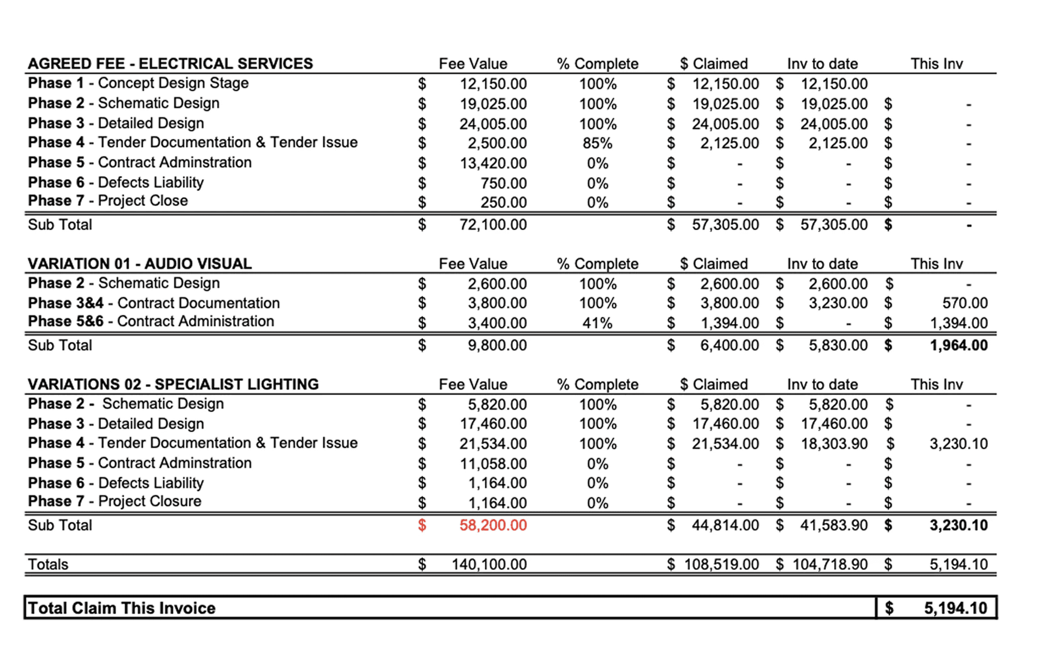
PDF payment form in it's raw form - separated contracts and variations into distinct sections, with variations referencing their parent contracts by name. This worked on paper but would create too much repetition in a digital interface.
Data-heavy tools like Notion, Jira, and Amplitude - use tags to show relationships. However, this approach wouldn't scale for Mastt—variations could be assigned to contracts, line items, or nested sections, and displaying all those names would consume valuable space and create visual noise.


I needed something more compact and scannable. While using Notion, I noticed their breadcrumb navigation used icons to represent hierarchy—this became the foundation for my approach.
INITIAL EXPLORATION
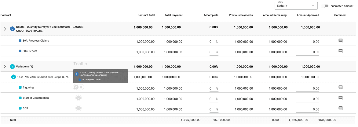
I started by using Mastt's existing icons (contract, line item, section) alongside truncated text labels to show variation relationships. This maintained familiarity but still drew too much attention away from the variation line items themselves.


REFINEMENT
Through multiple iterations and feedback sessions with engineers and stakeholders, I simplified further:
Icons only - Removed text labels entirely, using just the visual icons
Greyscale treatment - Reduced visual weight so icons communicated hierarchy without competing for attention
Hover interaction - Full relationship details appear on hover, keeping the default view clean
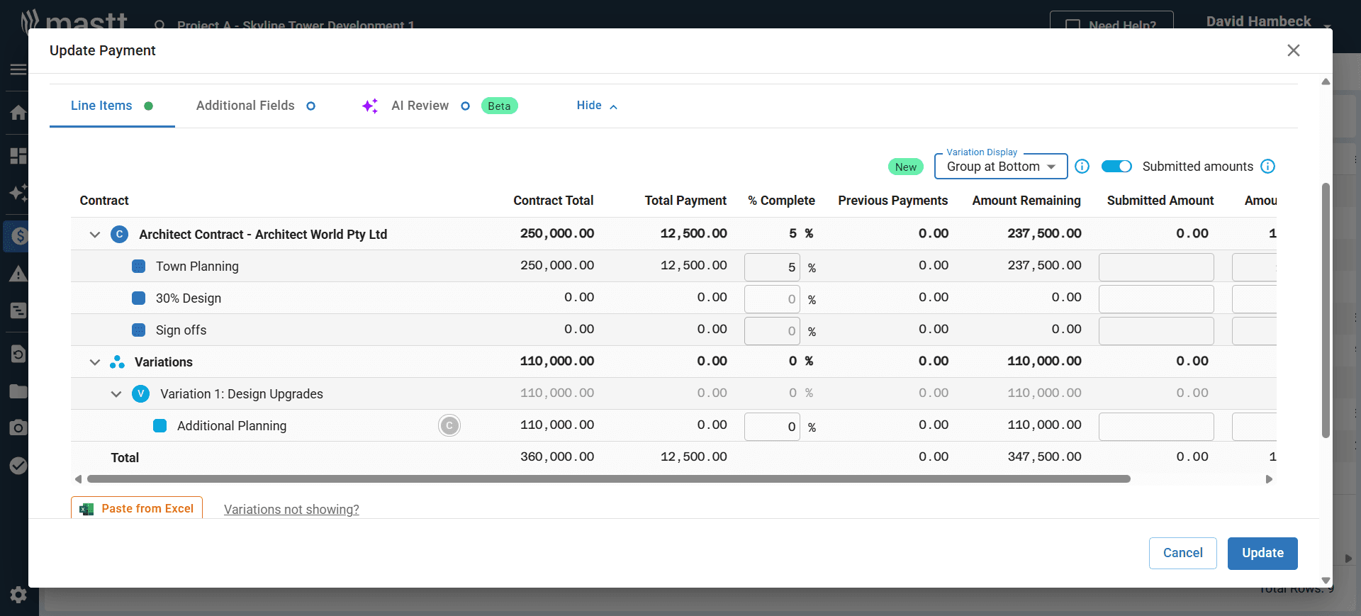
Validation: I created mockups showing different scenarios and gathered user feedback. Most users preferred the condensed view as the default, confirming that the simplified approach met their needs.
FINAL PROTOTYPE
The final design provides:
Collapsed variation groups by default for quick scanning
Icon-based visual system showing contract/section relationships without text clutter
Progressive disclosure through hover states for users who need full context
Flexible sorting and expansion so both casual and power users get what they need

WHAT'S THE IMPACT?
The redesigned payment form contributed to a 20% increase in feature usage as part of the broader variation improvement initiative. Users responded positively to the cleaner, more flexible interface:
"The separate view is cleaner, more useful to see variations all together."
"In the commercial construction space, the merged view would get pretty messy. With different views like that it's much easier to show clients and subbies."
The new design successfully balanced the needs of different user types—Project Managers could quickly scan payments without cognitive overload, while Project Control Managers retained full access to detailed cost data when needed.
TAKEAWAY FOR THIS PROJECT
Adapting research to startup constraints
Working in a fast-paced startup environment taught me to be pragmatic about the design process. When time is limited, getting a rough concept in front of users quickly often yields more valuable insights than spending weeks on perfect research artifacts. This project reinforced the importance of showing, not just telling—even lo-fi mockups can validate direction and uncover issues early.
Knowing where to invest time
I learned to identify which parts of the design process truly drive impact and where efficiency matters more than perfection. Understanding when to move fast and when to slow down for iteration is a critical skill in product design, especially when working as a sole designer with competing priorities.
SOLUTION BREAKDOWN
SOLUTION BREAKDOWN
SOLUTION BREAKDOWN
UNDERSTANDING & RESEARCH
UNDERSTANDING
& RESEARCH
UNDERSTANDING
& RESEARCH
I started by meeting with the CEO and Customer Success team to understand the pain points in depth. They walked me through real project payment forms and showed me PDF versions of what users were working with before entering data into Mastt.
The challenge was clear: reduce visual clutter while preserving the relationships between contracts, line items, sections, and variations.
Through these conversations, I identified three core user needs:
Flexible sorting - Users needed to organize payments by contract or variation depending on the task
Variable detail levels - Project Managers wanted a condensed overview, while Project Control Managers needed to expand for full detail
Visual relationships - Even in condensed view, users needed to see how variations connected to specific contracts and sections
EXPLORING THE SOLUTIONS
I looked at how similar information hierarchy problems were solved elsewhere:
PDF payment form in it's raw form - separated contracts and variations into distinct sections, with variations referencing their parent contracts by name. This worked on paper but would create too much repetition in a digital interface.
Data-heavy tools like Notion, Jira, and Amplitude - use tags to show relationships. However, this approach wouldn't scale for Mastt—variations could be assigned to contracts, line items, or nested sections, and displaying all those names would consume valuable space and create visual noise.
I needed something more compact and scannable. While using Notion, I noticed their breadcrumb navigation used icons to represent hierarchy—this became the foundation for my approach.
INITIAL EXPLORATION
I started by using Mastt's existing icons (contract, line item, section) alongside truncated text labels to show variation relationships. This maintained familiarity but still drew too much attention away from the variation line items themselves.
REFINEMENT
Through multiple iterations and feedback sessions with engineers and stakeholders, I simplified further:
Icons only - Removed text labels entirely, using just the visual icons
Greyscale treatment - Reduced visual weight so icons communicated hierarchy without competing for attention
Hover interaction - Full relationship details appear on hover, keeping the default view clean
Validation: I created mockups showing different scenarios and gathered user feedback. Most users preferred the condensed view as the default, confirming that the simplified approach met their needs.
FINAL PROTOTYPE
The final design provides:
Collapsed variation groups by default for quick scanning
Icon-based visual system showing contract/section relationships without text clutter
Progressive disclosure through hover states for users who need full context
Flexible sorting and expansion so both casual and power users get what they need
WHAT'S THE IMPACT?
The redesigned payment form contributed to a 20% increase in feature usage as part of the broader variation improvement initiative. Users responded positively to the cleaner, more flexible interface:
"The separate view is cleaner, more useful to see variations all together."
"In the commercial construction space, the merged view would get pretty messy. With different views like that it's much easier to show clients and subbies."
The new design successfully balanced the needs of different user types—Project Managers could quickly scan payments without cognitive overload, while Project Control Managers retained full access to detailed cost data when needed.
TAKEAWAY FOR THIS PROJECT
Adapting research to startup constraints
Working in a fast-paced startup environment taught me to be pragmatic about the design process. When time is limited, getting a rough concept in front of users quickly often yields more valuable insights than spending weeks on perfect research artifacts. This project reinforced the importance of showing, not just telling—even lo-fi mockups can validate direction and uncover issues early.
Knowing where to invest time
I learned to identify which parts of the design process truly drive impact and where efficiency matters more than perfection. Understanding when to move fast and when to slow down for iteration is a critical skill in product design, especially when working as a sole designer with competing priorities.
INITIAL EXPLORATION
I start to explore by using Mastt's existing icons (contract, line item, section) alongside truncated text labels to show variation relationships. This maintained familiarity but still drew too much attention away from the variation line items themselves.
REFINEMENT
Through multiple iterations and feedback sessions with engineers and stakeholders, I simplified further:
Icons only - Removed text labels entirely, using just the visual icons
Greyscale treatment - Reduced visual weight so icons communicated hierarchy without competing for attention
Hover interaction - Full relationship details appear on hover, keeping the default view clean
Validation: I created mockups showing different scenarios and gathered user feedback. Most users preferred the condensed view as the default, confirming that the simplified approach met their needs.
FINAL PROTOTYPE
The final design provides:
Collapsed variation groups by default for quick scanning
Icon-based visual system showing contract/section relationships without text clutter
Progressive disclosure through hover states for users who need full context
Flexible sorting and expansion so both casual and power users get what they need
WHAT'S THE IMPACT?
The redesigned payment form contributed to a 20% increase in feature usage as part of the broader variation improvement initiative. Users responded positively to the cleaner, more flexible interface:
"The separate view is cleaner, more useful to see variations all together."
"In the commercial construction space, the merged view would get pretty messy. With different views like that it's much easier to show clients and subbies."
The new design successfully balanced the needs of different user types—Project Managers could quickly scan payments without cognitive overload, while Project Control Managers retained full access to detailed cost data when needed.
TAKEAWAY FOR THIS PROJECT
Adapting research to startup constraints
Working in a fast-paced startup environment taught me to be pragmatic about the design process. When time is limited, getting a rough concept in front of users quickly often yields more valuable insights than spending weeks on perfect research artifacts. This project reinforced the importance of showing, not just telling—even lo-fi mockups can validate direction and uncover issues early.
Knowing where to invest time
I learned to identify which parts of the design process truly drive impact and where efficiency matters more than perfection. Understanding when to move fast and when to slow down for iteration is a critical skill in product design, especially when working as a sole designer with competing priorities.
WHAT'S
NEXT?
WHAT'S
NEXT?


FINAL PROTOTYPE
The final design provides:
Collapsed variation groups by default for quick scanning
Icon-based visual system showing contract/section relationships without text clutter
Progressive disclosure through hover states for users who need full context
Flexible sorting and expansion so both casual and power users get what they need